CDO, R&D
The first step to change is conversation. And in the last few years, conversation around accessibility of scholarly content has gained tremendous pace. Nearly every conference I’ve attended has had panel discussions and presentations addressing the need for integrating accessibility into core business strategy and deliberating the challenges that come with it.
While we have much to do in this space, the speed at which the industry has adopted change to make accessing content easier for everyone is positive.
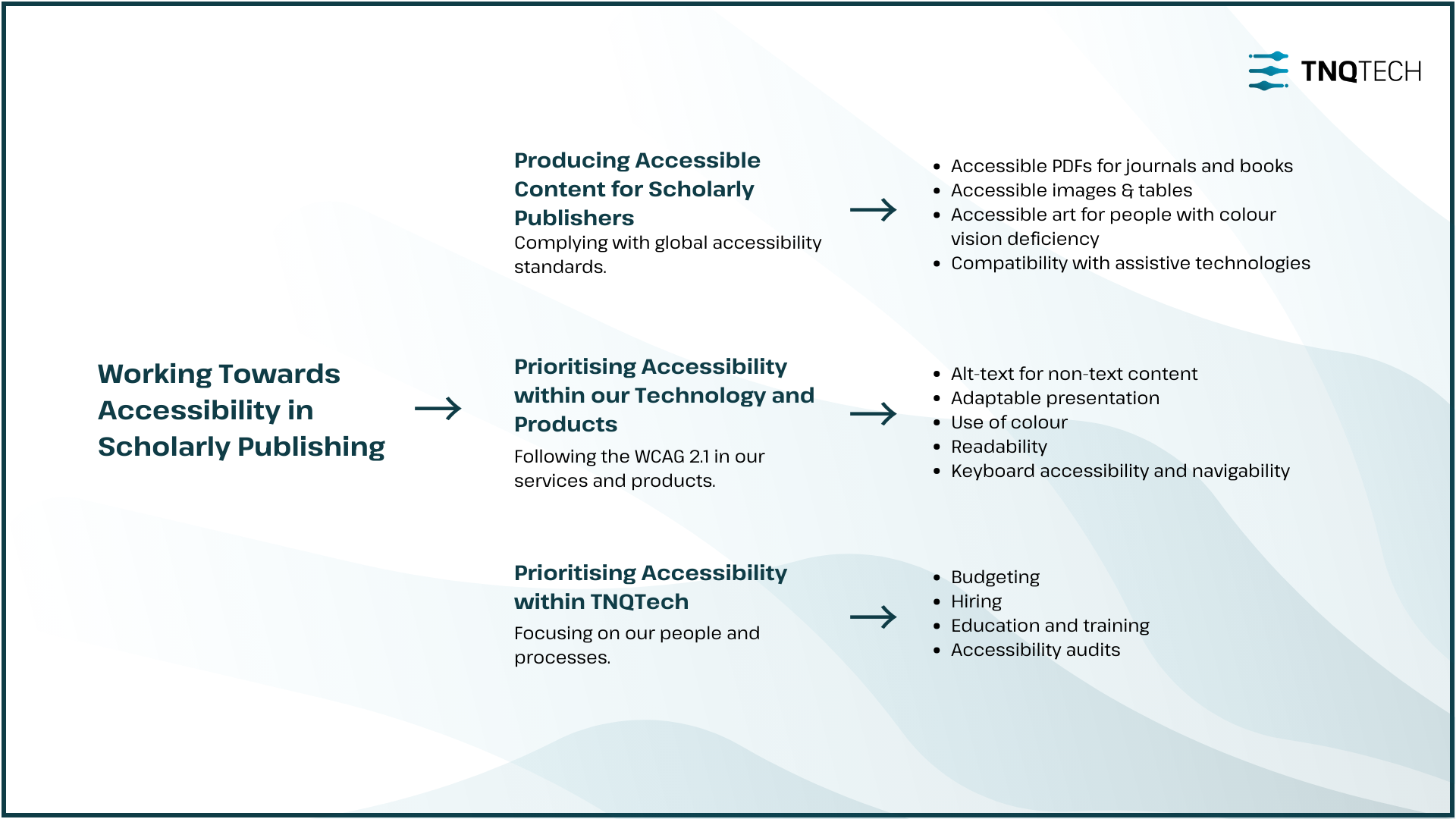
At TNQTech, we are evaluating several ideas on making content that we produce for publishers accessible, in a consistent and automated way, on a large scale, and with quality oversight from experts. There is a lot in the pipeline and a lot more to think about. So far, here’s everything we are doing in 2024 in this space.
Scholarly publishers around the world are making changes within their organisations and their workflows to better accommodate authors, readers, and staff, with disabilities. Over the years we have been collaborating with them to comply with global standards and laws around accessibility.
This is an exciting development for us, as we work towards fully-automated tagging of PDF files on a large scale. We are seeing tremendous success with this. We will also continue to create tagged PDFs using industry-standard typesetting software, as a part of our XML-first workflows
With longer chapters and different formats from journals, we are working on a pilot programme to produce tagged PDFs for STM books in an automated manner, so readers can access these books with screen readers and other assistive technology.
Images and tables form crucial parts of manuscripts. Our language editors add alt-text to these no-text elements within the underlying XML during the conversion process, so accessibility is woven into the workflow from the beginning. Our work on auto-generation of alt-text with a human-in-the-loop approach is in full swing.

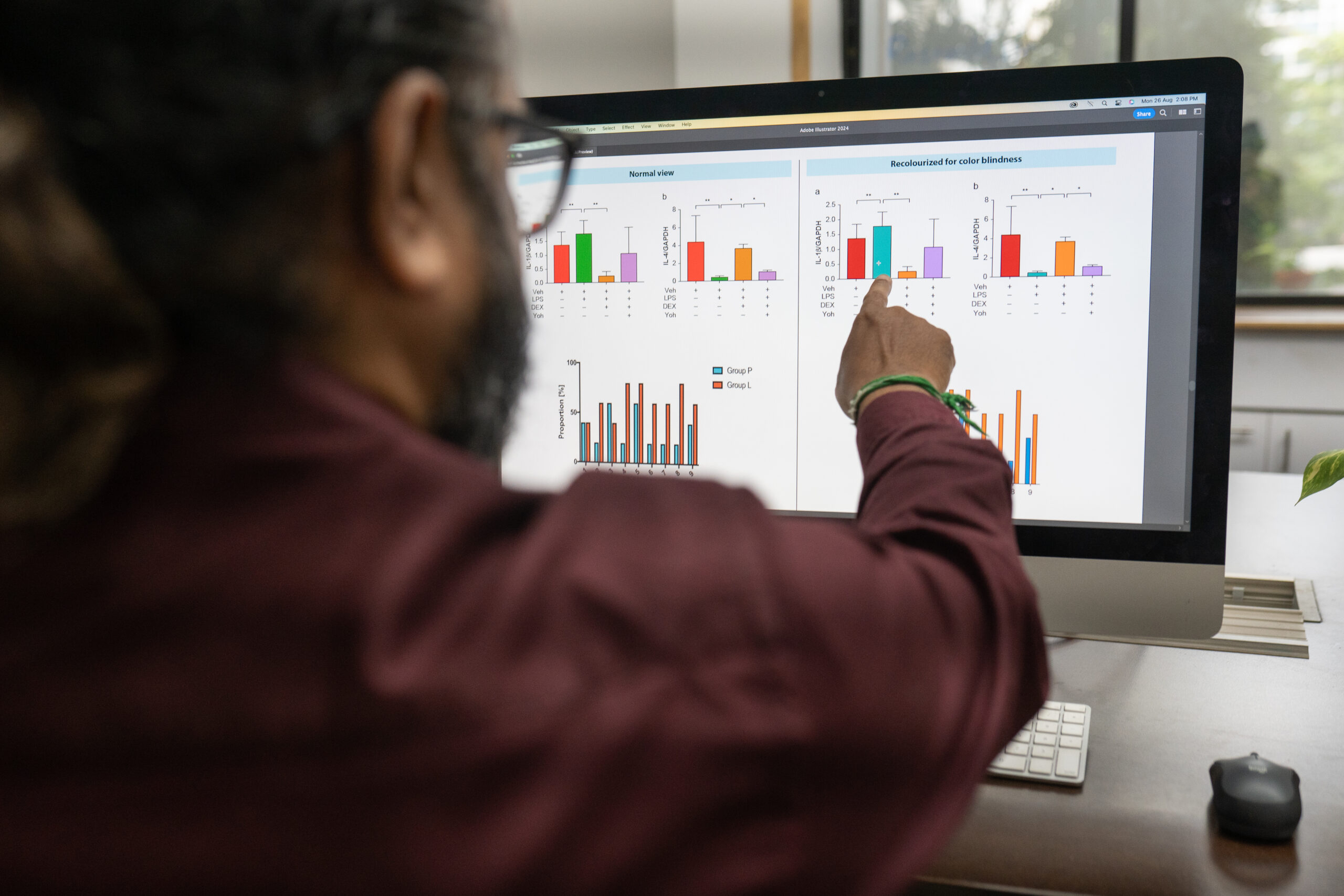
Our team of illustrators and artists create colour palettes that are accessible for people with colour vision deficiency. We redraw and recolour in suitable palettes, using colour in clever ways to continue to convey meaning in a more inclusive manner.

In order to create a future-proof web experience and ensure that all users, regardless of the technology they use, can access our content effectively, we’re committed to making our content compatible with current and future user agents, including assistive technologies.
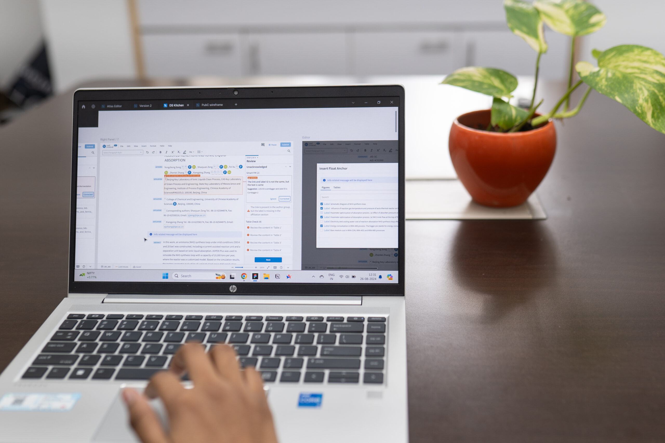
In addition to implementing the Web Content Accessibility Guidelines (WCAG) 2.1 in our work with scholarly journals and books, we also follow the industry standard WCAG 2.1 for our own technology and products – those that are part of our internal processes, as well as those that publishers and authors use.
We’re working to provide text alternatives for all non-text content including images, icons, and other media, so that users with visual impairments will be able to engage with all content through their screen readers, improving their overall experience.
We’re ensuring that our content can be presented in different ways, through simpler layouts, for instance, without losing information or structure. This is to make our content more accessible to users with various disabilities, including those with cognitive impairments.
We make the effort not to use colour as the only visual means of conveying information, indicating an action, prompting a response, or distinguishing a visual element. Where we do use colour, we’re working to adhere to a minimum contrast ratio of 4.5:1 for normal text and 7:1 for enhanced contrast (AAA standard). This is in order to reduce eye strain and allow users with visual impairments, including those with colour vision deficiency, to have an improved reading experience.
To ensure maximum readability, we’re ensuring that text can be resized up to 200% without loss of content or functionality.
Where text spacing is concerned, in content implemented using markup languages that support the following text style properties, we’re working to ensure that no loss of content or functionality occurs by setting i) line height (line spacing) to at least 1.5 times the font size; ii) spacing following paragraphs to at least 2 times the font size; iii) letter spacing to at least 0.12 times the font size; and iv) word spacing to at least 0.16 times the font size.
Where additional content becomes visible on hovering the cursor on an element, we want to make sure that this content is dismissible, hoverable, and persistent.
We will ensure our text is readable and understandable, avoiding jargon and instead using plain language. We will also provide users enough time to read and use content by eliminating time constraints where possible.

We will make all functionalities available from a keyboard, ensuring users who cannot use a mouse can navigate our interfaces. This enhances usability for users with motor disabilities, providing a seamless navigation experience.
We will continue to think about accessibility in terms of our people, our processes, our customers, and authors, and have made significant progress on all these fronts.
We work with accessibility consultants who challenge us and help us think about new possibilities. We are hosting accessibility bootcamps for all our teams, and carry out periodic audits to find and fill gaps.
I will be writing more about our experiments with accessibility as we make progress, and am always up for a conversation around what else we could be doing.
